My Sweeten Story: A Renovating Couple Gains Their Urban Chops
A DIY tiling job leads to a bigger renovation the Hudson Yards homeowners had planned
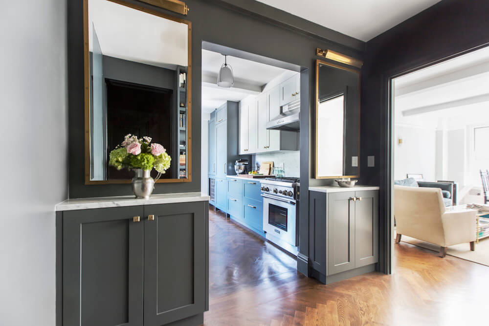
“After” photos by Miao Jiaxin for Sweeten
- Homeowners: Jeremy and Chris posted their Hudson Yards renovation on Sweeten
- Where: Hudson Yards neighborhood in Manhattan, New York
- Primary renovation: A remodel of their 778-square-foot co-op’s kitchen, bathroom, and a multi-functioning entryway.
- Sweeten general contractor
- Sweeten’s role: Sweeten matches home renovation projects with vetted general contractors, offering advice, support, and up to $50,000 in renovation financial protection— for free.

Written in partnership with Sweeten homeowner Jeremy
Learning to navigate a New York renovation
A first—and obvious—lesson in renovating: it really is harder in New York. When my husband Chris and I embarked on this adventure, we had thought we knew what we were doing. After all, we’d undertaken a remodel of our 1914 Seattle condo before. But that was all before we decamped to New York for work—and learned what a reno here really takes.
Our real estate agent brought us to a 1929 building we would have never come to on our own, smack next to the construction zone that is Hudson Yards. I was hesitant, but Chris saw a decent amount of room and a good layout in a developing neighborhood.
After moving in, we wanted to redo the kitchen, but the most urgent fix was the bathroom. Some prior higher-floor leak had unmoored a section of tile, and the previous owner refused to repair it as a condition of closing. This was our first lesson in how different a Seattle and New York renovation could be.
Deciding to do the larger renovation
Our foray into bidding a standalone bathroom remodel proved short—we got as far as finishing the design when the co-op came back with a series of unexpected plumbing requirements, chock full of things we’d never heard of like water hammer arrestors and Laticrete. The price nearly doubled, and if we were going to spend much more on a remodel, we decided we should save up and do the larger apartment renovation we had hoped to.
With regular re-spackling, we figured we could buy time while we saved up. That folly ended a year and a half later when, hours before leaving for vacation, a precarious section of tile came crashing down. Our super covered the crumbling wall with a plastic tarp, but it was clear: it was time to begin bidding.
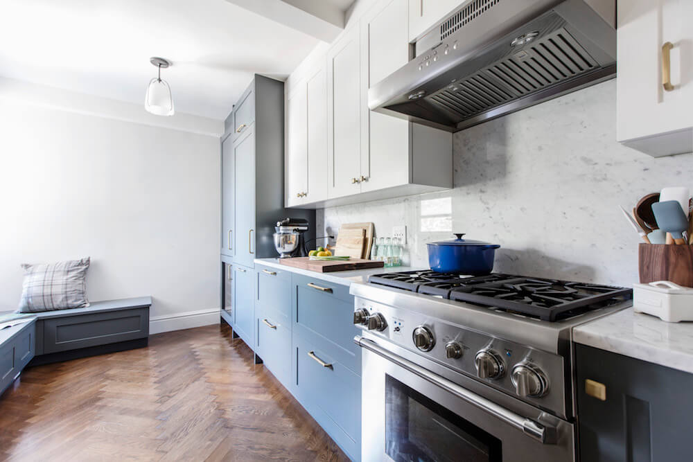
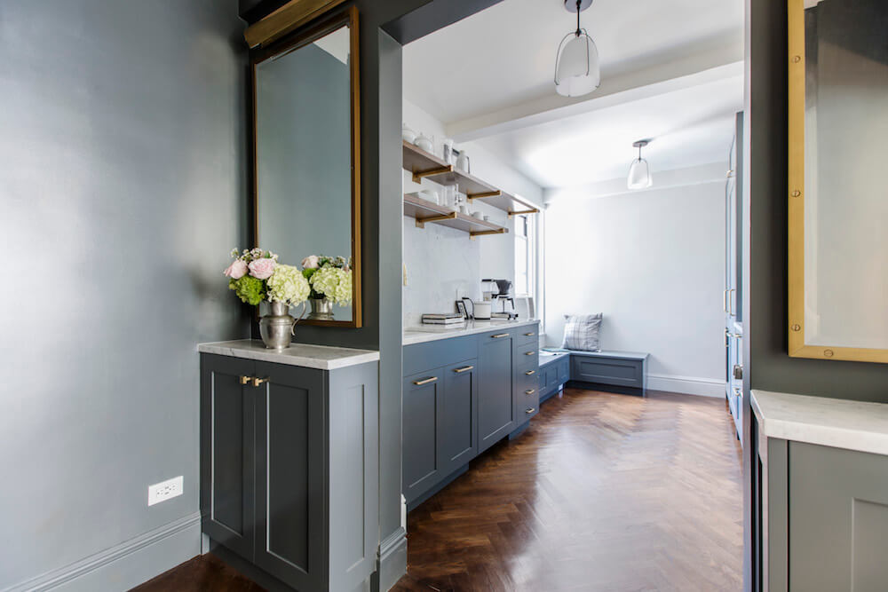
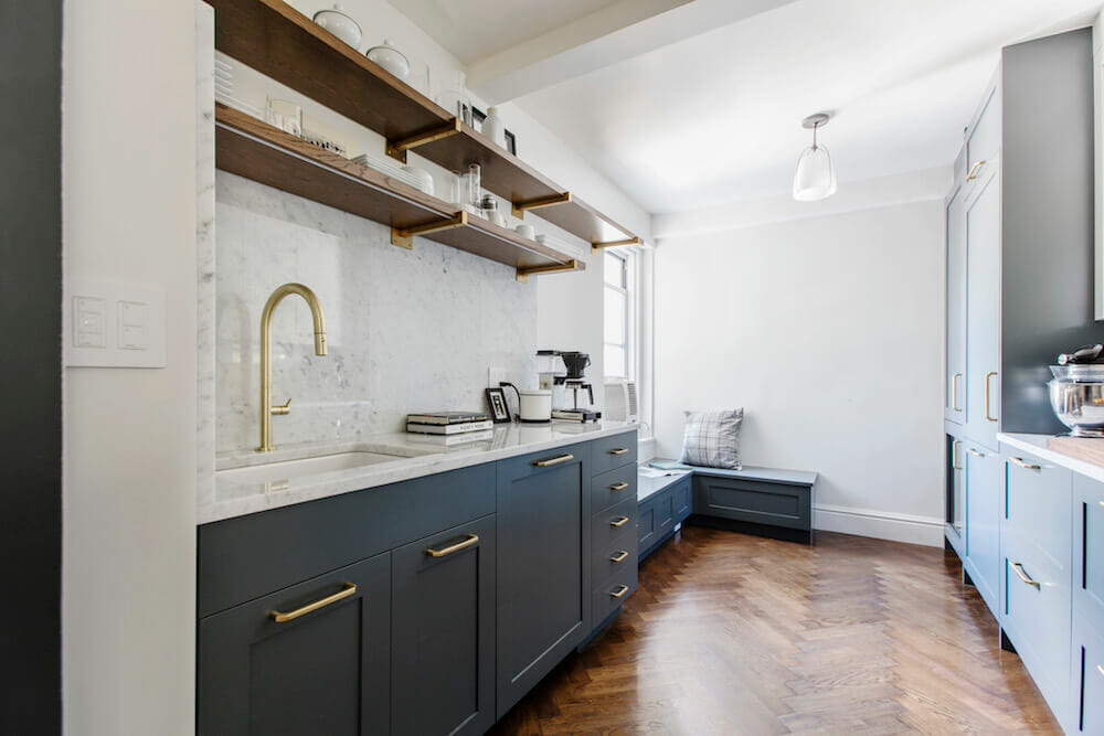
…we raided a savings account and scrambled to add herringbone floors to the scope. The late choice delayed the project by a month, but it was one of the best decisions we made. costs.
Finding the right general contractor with multiple skills
We weren’t sure exactly what we needed—walls weren’t moving per se, but our co-op seemed to want an architect. So while we asked the initial bathroom contractor to bid, we also thankfully posted our project on Sweeten. To complete our renovation, Sweeten paired us with a design-build firm with architecture training. They also did custom millwork, making it the perfect fit for our project. Not only did the general contractor immediately understand our aesthetic, but we also had a great rapport.
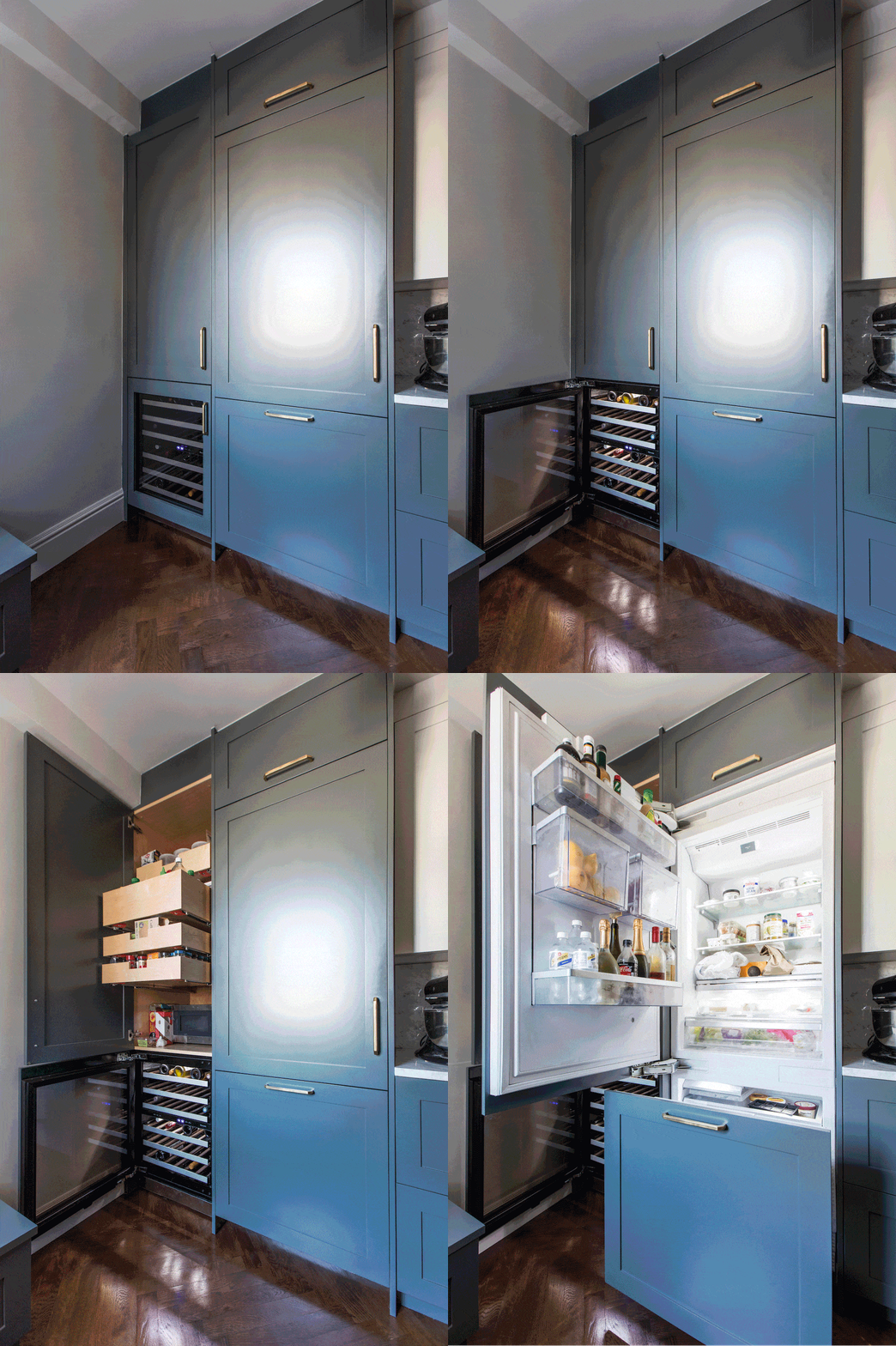
In planning the remodel, we knew we wanted to play off the building’s modest Art Deco bones, but in a way that wasn’t slavish or theme-y. We also both brought mild obsessions to the mix—for me, an inexplicable passion for English cabinetry, for Chris, a desire to put a banquette in any possible corner.
Reworking the kitchen layout
The first big choice was how to manage the kitchen layout. The room was spacious enough—designed as an eat-in when 24” of counter space seemed ample—but the two doorways weren’t in an ideal location. One opened onto the foyer and the other onto a back hallway by the bedroom. It had also been poorly updated in the intervening years: half of the footprint was wasted, with a lonely refrigerator in one corner and an errant desk in another.
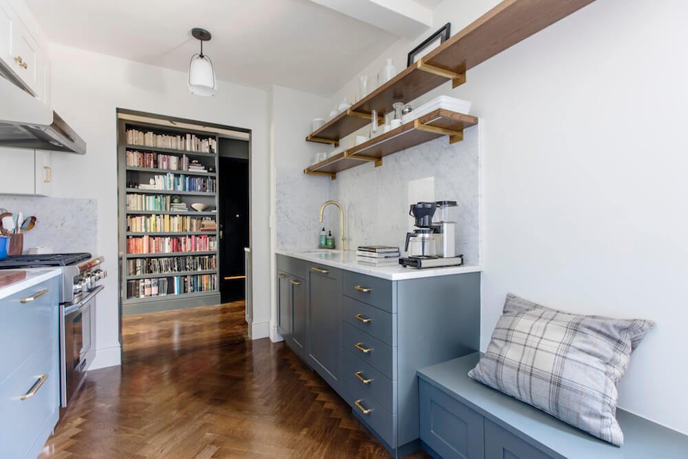
The location of the gas riser dashed our hopes of moving the entry to adjoin the living room, so our contractor suggested closing the smaller opening to create a wide galley with room for a banquette. This would extend the cabinetry the length of the room on one side, doubling the counter space and creating room for a wine fridge and pantry to boot.
While we played with centering the sink and range on the counter runs, our Sweeten contractor advised against it to preserve prep space. In hindsight, we were happy to have lived in the space before renovating: symmetry looked better on paper, but from experience cooking in the space, we knew her recommendation would be more functional.
To keep the room from feeling enclosed, we substituted upper cabinets for extra-long open shelves on one side, then tucked in under-cabinet lighting for function. The banquette capped off the space, creating both more storage and a place for friends to hang out while cooking.
Giving the foyer a purpose
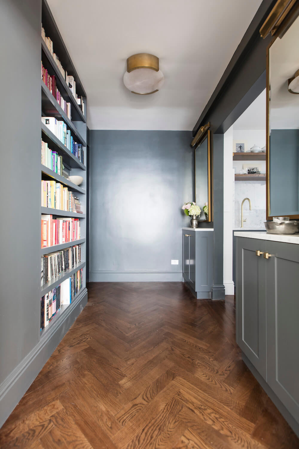
Our foyer situation was a classic New York City conundrum: too small to do much of anything useful but large enough to be wasted if empty. We decided on a full-height bookcase that’s only 8” deep and it holds loads more than we expected. On the opposite side, our general contractor fitted narrow custom cabinets to serve as a bar. There’s just enough depth to squeeze in double rows of liquor bottles and glasses, saving precious room in the kitchen. We ran new electrical to hang art lights over tall mirrors—the goal was to make the whole space pull triple duty as an entryway, a library, and a bar—then painted the foyer and kitchen cabinetry the same deep gray so that the two spaces relate.
A renewed bathroom in classic black-and-white
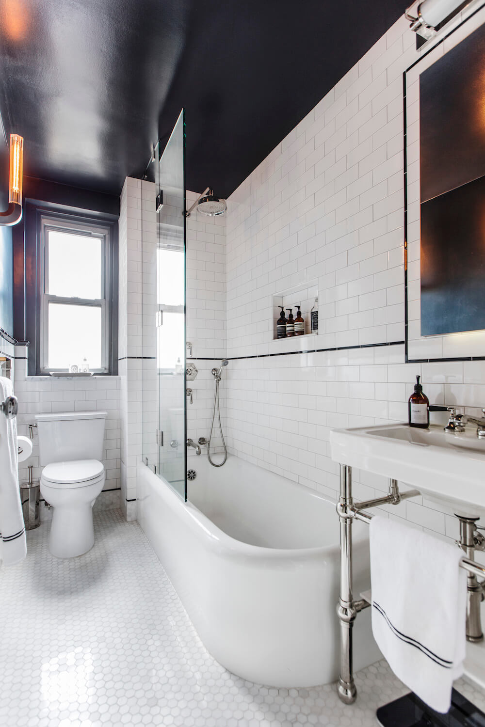
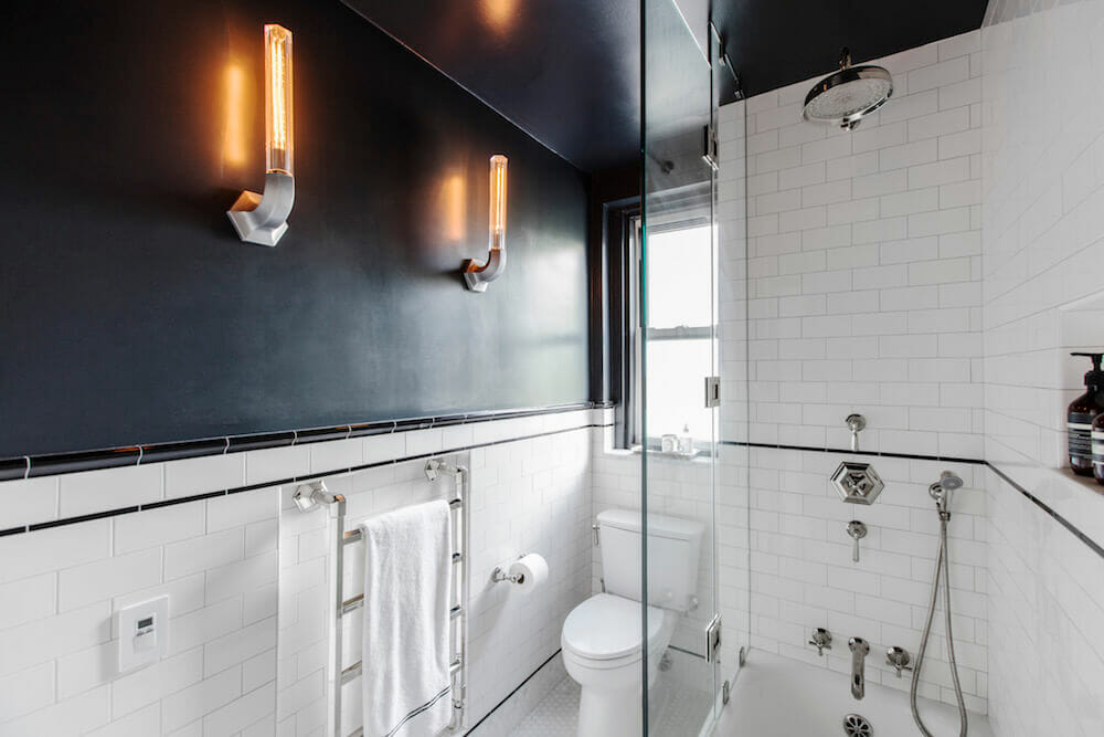
In the bathroom, we preserved and refinished an original tub and stuck to a classic black-and-white New York-inspired scheme with updated finishes. Given the narrow layout, the primary play here would be with subtle geometries—and taking advantage of our building’s extra thick walls. A hex marble floor worked well with the warmer white subway tile and porcelain. Our contractor recommended extending the floor tile onto the base of the walls to stretch the visual plane of the room.
The hexagon echoed in new shower controls that help tame the notorious temperature fluctuations that come with living in an old building. In such a small space, we took a cue from hotel bathrooms and put a pedestal sink atop console legs to keep the space open. An extra-tall recessed medicine cabinet provides both storage and electrical outlets.
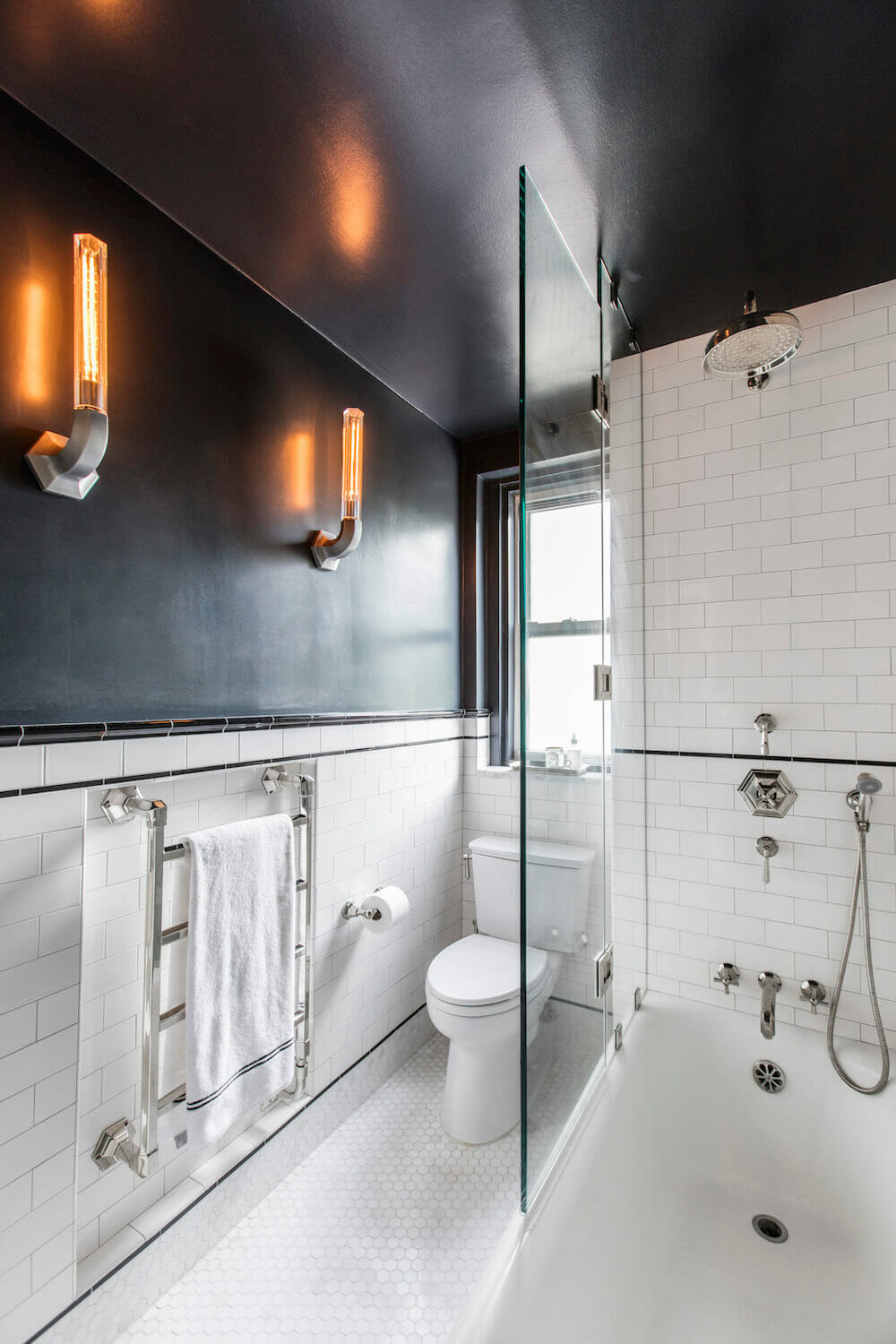
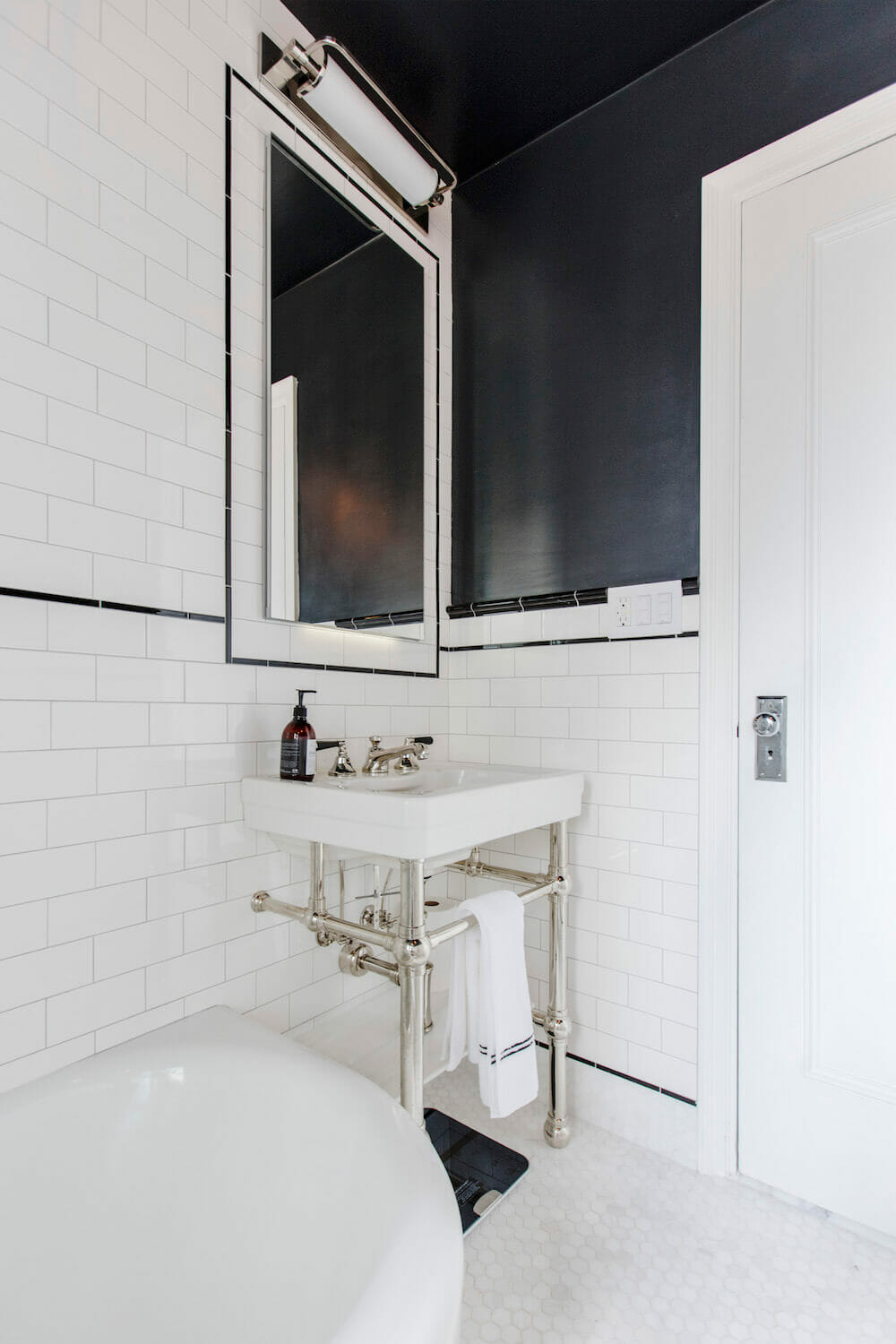
My favorite thing of all is the towel warmer which took forever to source but that I deeply love for its hex bars and Anglophilic appeal. The contractor placed it in a deep niche so that the warm rails wouldn’t risk singeing passersby. We decided to paint the walls and ceiling in a black high sheen that makes the ceiling recede and the white surfaces gleam. Strangely, of all the things in the apartment, the shower glass proved one of the most frustrating: it wasn’t installed until five months after everything else wrapped up.
Finding the budget for hardwood floors
New wood floors were the most unexpected part of the reno. We had only budgeted for the kitchen alone. But the more floor options we looked at—and after our contractor dissuaded us from several temptations like Moroccan Bejmat tile—the more we wanted hardwood in the kitchen. That meant either putting down maple boards to match the rest of the apartment—despite disliking their color—or redoing everything. Our contractor’s opinion was that changing the kitchen floors would make one of the biggest impacts in the space. So a month into the renovation, after all the other demo was done, we raided a savings account and scrambled to add herringbone floors to the scope. The late choice delayed the project by a month, but it was one of the best decisions we made.
Becoming comfortable with flexibility
Stepping back from it now, our major lesson was in developing a deep comfort with flexibility. We found that we could be much more controlling of our remodel in Seattle than here. New York’s interminable series of permits, co-op requirements, and engineering reports—paired with the inelasticity of old spaces—meant we had to take a go-with-the-flow approach that made trust and an ability to laugh key. Also, best to know exactly what you’re looking for before you start to remodel.
Our contractor taught us the biggest lesson of all: do it all at once if you can. It’s not the disruption that’s the problem, really, or that rework ends up costing more—it’s that few of us really have the talent to create a cohesive space in small increments. Unfortunately, we didn’t quite learn this last lesson in time. During our reno, our bedroom became the storage unit for our furniture.
More than anything else, we were lucky to have a real partnership with our Sweeten general contractor to see us through the changes and warn us off of bad choices. We feel a bit like we’ve earned our honorary New Yorker stripes: we chose a space that we thought was a diamond in the rough and hoped we could turn it into a classic city respite. We feel like—at least to our taste—we got there, and now we have this lovely, large-living one-bedroom to come home to in one of the most dynamic parts of Manhattan.
Thank you, Jeremy and Chris, for sharing your Hudson Yards home renovation with us! Check out more about it in this article from New York magazine’s The Cut.
Materials Guide
KITCHEN RESOURCES: White oak hardwood floors in espresso stain: Minwax. Cabinets and under-cabinet lighting: Custom by general contractor. Kitchen cabinet paint in Down Pipe, wall paint in Strong White, and ceiling paint in Wimborne White: Farrow & Ball. Regent Collection cabinet pulls: Restoration Hardware. Super White Carrara marble countertop and backsplash: HG Stones. Shaws Original farmhouse sink: Rohl. Faucet in satin brass: California Faucets. Refrigerator, dishwasher, stove, hood, and wine fridge: Thermador. Haleigh ceiling light fixture: Rejuvenation.
BATHROOM RESOURCES: Fitzgerald Collection sink: DXV. Console legs in polished nickel: Palmer Industries. Monterey faucets: California Faucets. Bianco Dolomiti 1 ¼” hex floor tile: Artistic Tile. White subway wall tile and black liner tile: Subway Ceramics. Astor collection hardware and shower fixtures: Jaclo. Verenne sconces: Restoration Hardware. Thomas O’Brien light fixture over medicine cabinet: Circa Lighting. Recessed medicine cabinet: Robern. Eco Drake toilet: Toto. Frameless glass shower surround: Glasscrafters. Ceiling and wall paint in Off Black: Farrow & Ball. Towel warmer: Vogue UK.
FOYER RESOURCES: Cabinetry: Custom by general contractor. Super White Carrara marble countertop: HG Stones. Cabinetry and wall paint in Down Pipe, ceiling in Wimborne White: Farrow & Ball. Regent Collection cabinet pulls: Restoration Hardware. Kelly Wearstler flush-mount ceiling light fixtures, Thomas O’Brien art light fixtures: Circa Lighting. Baseboards: Kuiken Brothers.
—
Angela’s bathroom in a landmark New York City building gets a classic yet modern update.
Refer your renovating friends to Sweeten and you’ll both receive a $250 Visa gift card when they sign a contract with a Sweeten general contractor.
Sweeten handpicks the best general contractors to match each project’s location, budget, and scope, helping until project completion. Follow the blog for renovation ideas and inspiration and when you’re ready to renovate, start your renovation on Sweeten.
The post My Sweeten Story: A Renovating Couple Gains Their Urban Chops appeared first on Sweeten.
from Sweeten https://sweeten.com/sweeten-renovations/entire-home-renovations/hudson-yards-renovation-updates-foyer-kitchen-bath/
via IFTTT
Comments
Post a Comment