My Sweeten Story: A 1930s Kitchen Gets a Chic Vibe in LA
A personally-designed kitchen and refreshed laundry room revive a historic Los Angeles home
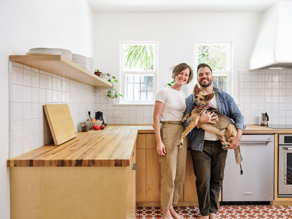
“After” photos by Madeline Tolle for Sweeten
- Homeowners: Chrissy, a costume designer in the film industry, and Matt, a production company operations manager, posted their project on Sweeten
- Where: The Historic Filipinotown neighborhood in Los Angeles, California
- Primary renovation: The couple embarked on a re-envisioning of the existing Art Deco kitchen in a minimalist light
- Sweeten general contractor
- Sweeten’s role: Sweeten matches home renovators with vetted general contractors, offering advice, support, and up to $50,000 in renovation financial protection—for free
Written in partnership with homeowner Chrissy
A fashionable—but not functional—period kitchen
The kitchen was original from the 1930s and very Hollywood Art Deco. It was just one aspect we loved when we purchased our 1,400-square-foot co-op, located in a 1932 Spanish Revival building in Historic Filipinotown, a neighborhood near Los Angeles’ Echo Park.
 Matt and I previously lived in a 600-square-foot apartment and never spent days hanging at home—it just didn’t have enough light and space. Looking for our next place, we realized that everything in our price range needed a large overhaul, or had been cheaply flipped and had an ugly poorly-designed kitchen.
Seeking a fixer-upper kitchen
I love to cook, and during our search, we’d decided that the sweet spot would be a place that was in good shape and had character but needed a new kitchen.
As first-time renovators, we figured the hardest parts would be finding a contractor, negotiating bids, and avoiding surprise hidden costs. When we found the one on Sweeten, it turned out our biggest challenge was actually not hiring an architect or designer as well. I sketched the kitchen out on my word processor!
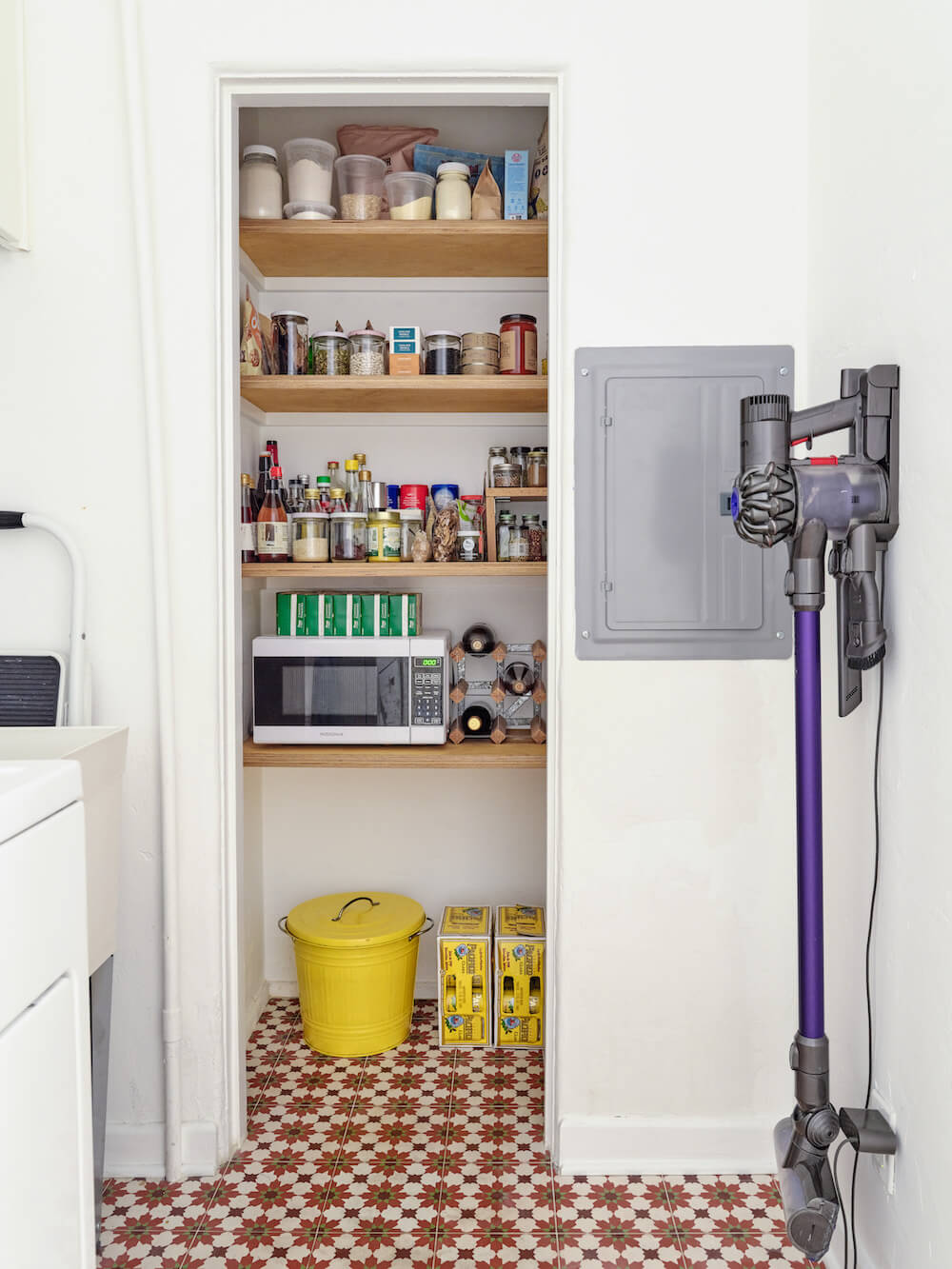
 Thinking we would re-do the kitchen right away, we purchased an induction hotplate and set it on the beautiful black-and-teal tile countertop. We found a basic fridge on Craigslist. We would also need to upgrade the unit’s electrical panel; we didn’t have the amps to run the hotplate and toaster simultaneously. When we first moved in, a kitchen wall had to be ripped out due to a leaky roof. It stayed that way until the renovation; it was rough in there!
Flooring material for wet spaces
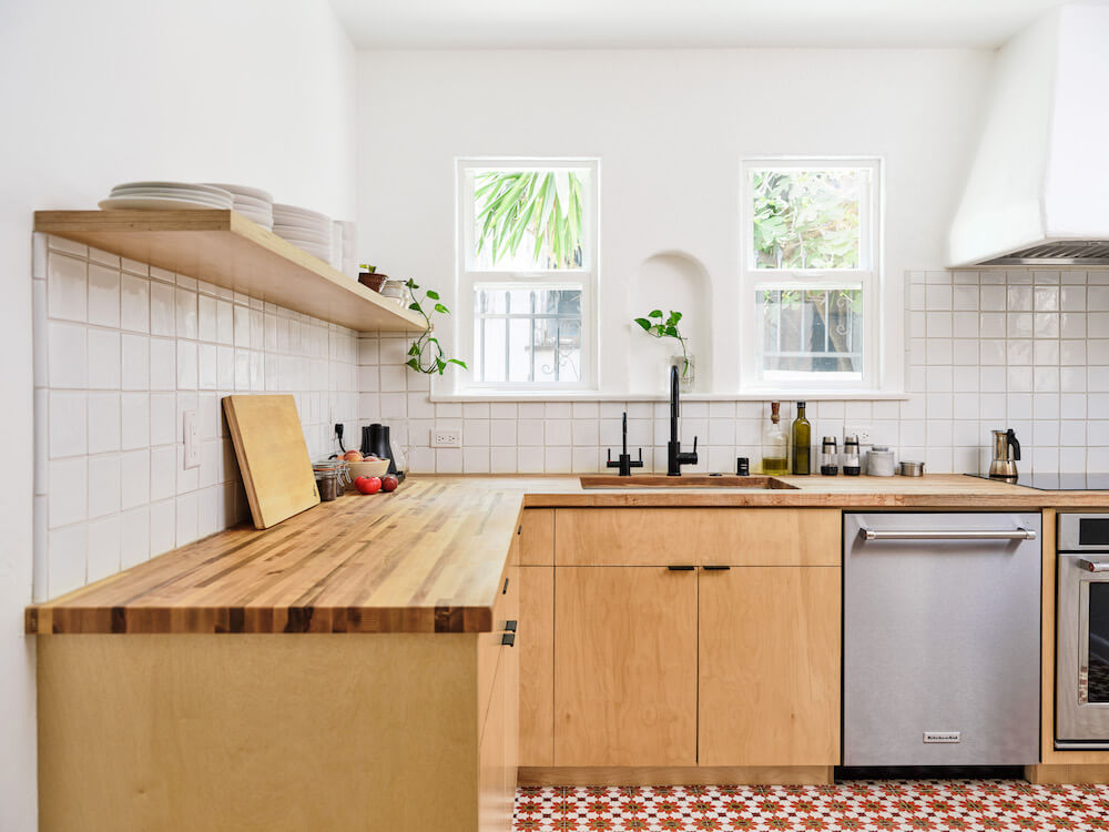
We thought about trying to save the Art Deco details, especially the original tile countertops and the matching backsplash. But preserving the original aesthetic wasn’t an option. The counters weren’t the modern standard depth, so new appliances would not fit. We struggled with whether to go with deco tiles and white cabinets or scrap all that and let it be something modern. We went with the latter.
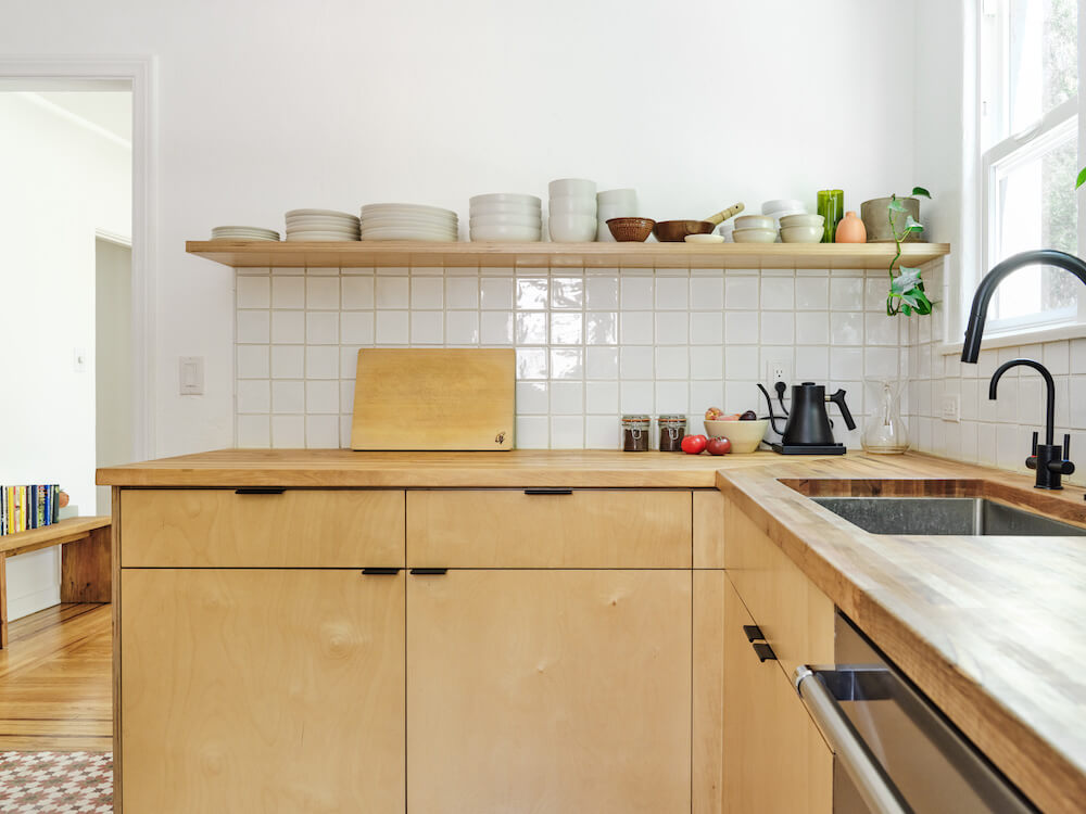
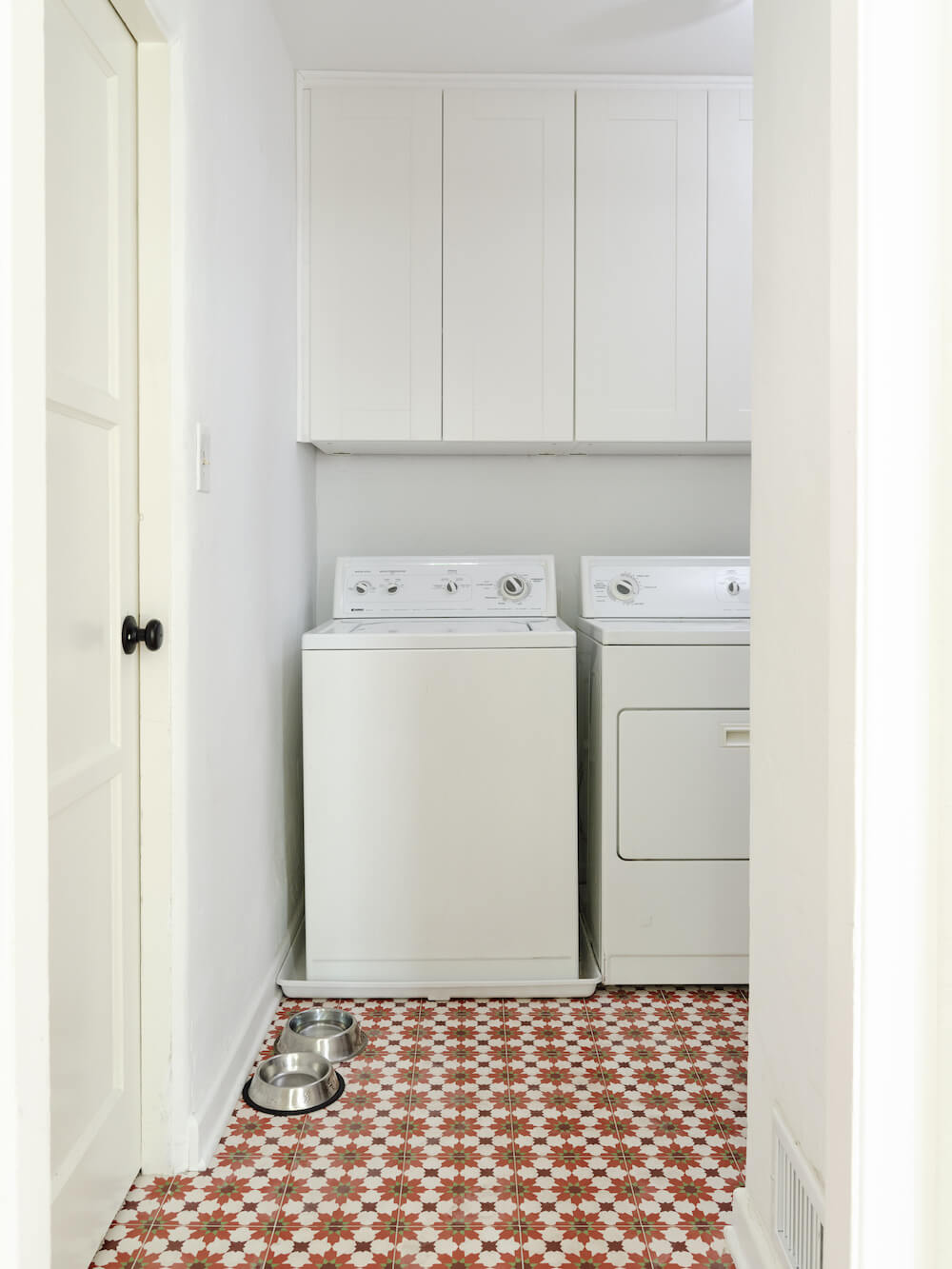
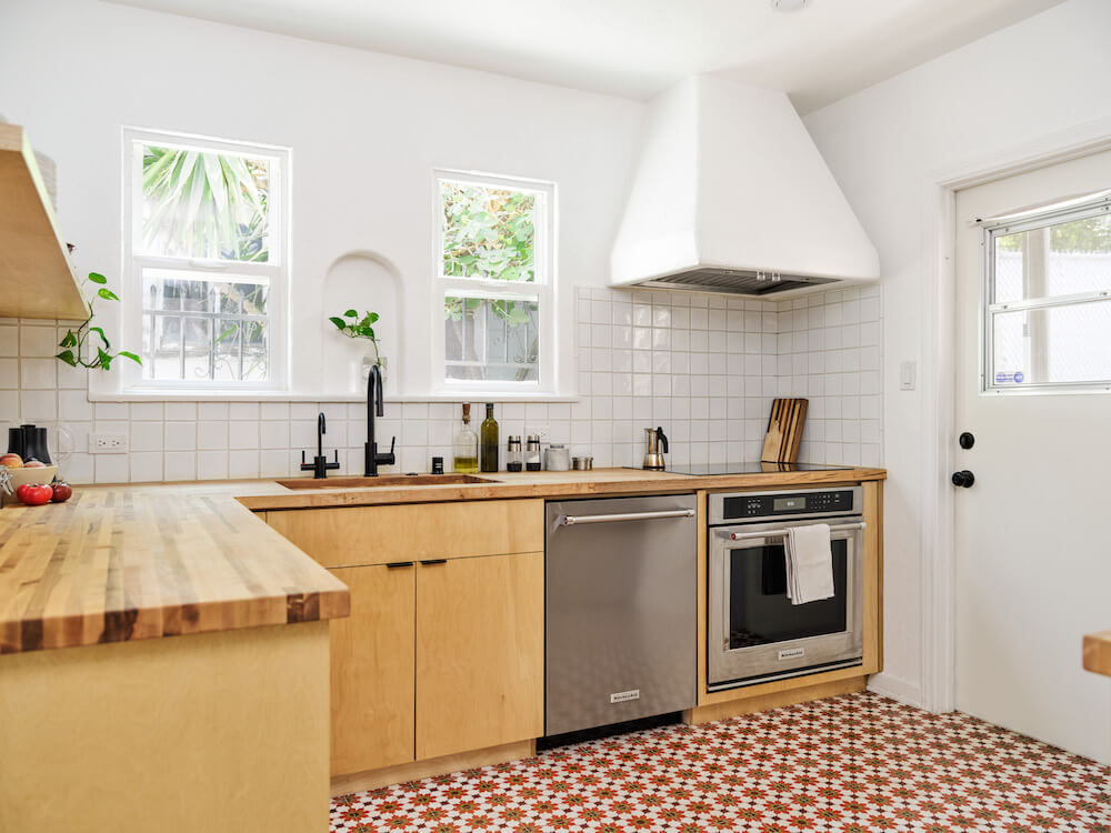
Going from the ground up, we discussed adding hardwood or cork flooring for a soft surface underfoot but decided against it. We wanted to make the kitchen contiguous with the laundry room, and we chose cement tile flooring to avoid worries about moisture. Another draw had to do with dirt. In our old apartment, we’d had terracotta tiled floors, which we loved, but the wide grout collected grime. The cement tile made for narrow grout and seemed practical. It also brought a bold texture to our floors.
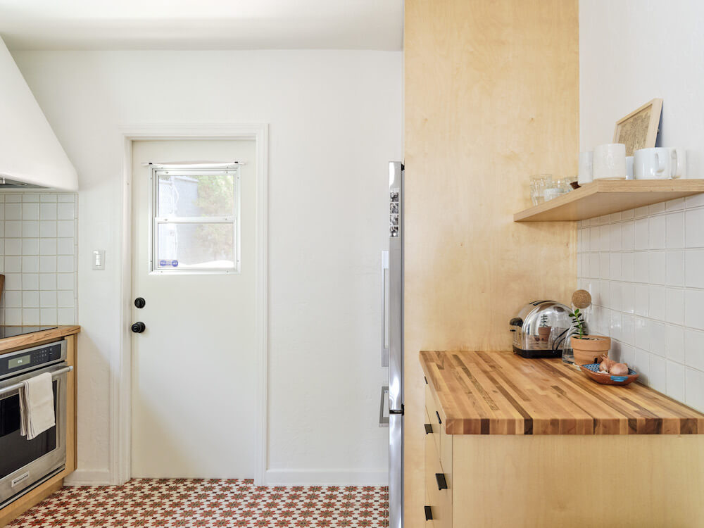 Plywood cabinets and cement floor tile ground the kitchen
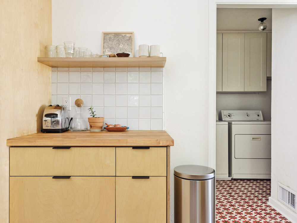
Having ruled out natural wood for the floors, we were excited to use it for the cabinets. We feel intuitively drawn to wood and have chosen it for surfaces throughout our home, so we let that lead us. We went with plywood kitchen cabinets—it’s a cost-effective material, and we liked its functional aesthetic. Designing the layout for the custom base plywood cabinets was gratifying. Since we could dictate all dimensions, we spent time going over all of our kitchen wares and deciding how we wanted to store things. We’d measured the height of the coffee grinder and Chemex pitcher and knew which drawer they would live in long before the kitchen was built.
We thought a lot about the upper cabinetry, too. We initially felt nervous about open shelving, thinking everything would get dusty. But in the end, we did it, mainly to save money, and it turned out to be a great choice to keep the visuals simple and open. It makes putting away dishes a breeze!
Personalized features make it home
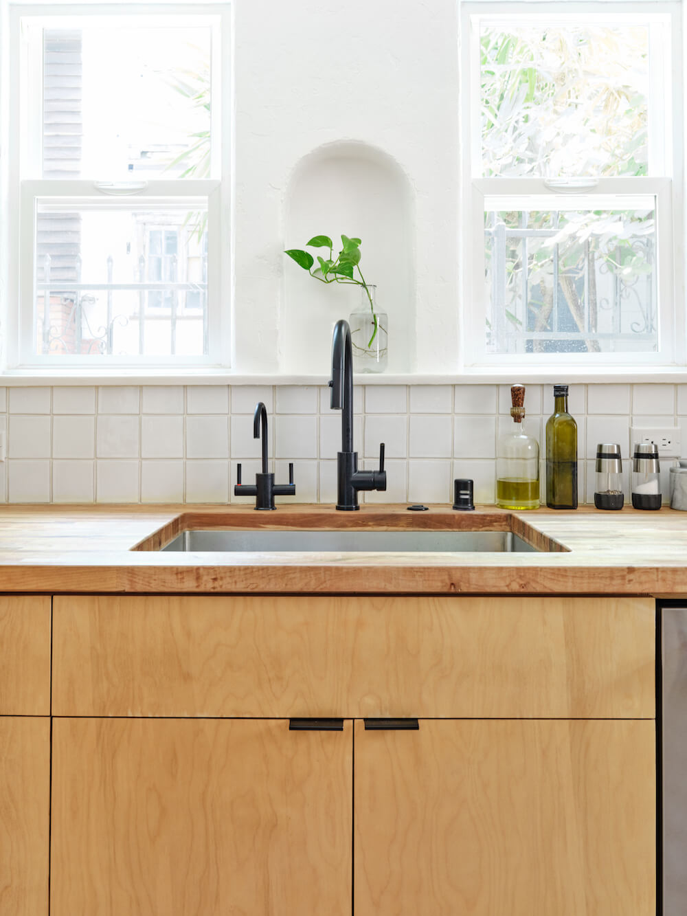
The backsplash was also cost-contingent. We kept saying we’d do subway tile to save money—but decided on handmade, natural clay tiles that look so right with the plaster walls. Plastering the hood was another important detail for us; it became a way to draw the co-op’s original character into our modern design.
 We didn’t agree on everything. My uphill battle was to convince Matt to spend the extra money to put in taps for filtered and boiling water. As the cook of the house and the one who drinks the most water, I felt strongly that this would pay off in convenience. Matt finally agreed, and it really has.
Finishing touches for the laundry
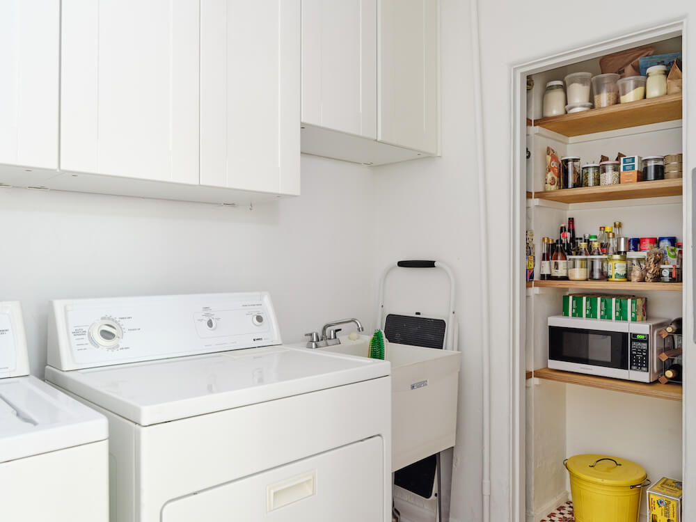
The laundry room was another area where plumbing was key, and our Sweeten contractor got involved there, too. We’d installed cabinets ourselves above the washer and dryer before starting the kitchen renovation. However, the washer and dryer, which were included in the house purchase, had exposed hookups. We upgraded by having the contractor recess them into the wall. The dryer had been vented through a hole in the floor that looked like it was cut with a Sawzall, so we finished that, too. We invested in an on-demand hot-water heater and installed an $85 utility sink. Someday we’d like to get front-loading machines and put in a countertop to really pull that room together.
 Good communication with their general contractor
Throughout the process, our Sweeten contractor was very communicative, which was lucky. When little things went wrong, he was determined to fix them and make us happy. We are grateful to the Sweeten team for helping us find him! We spent just under $56,000 on the whole project. I’m not sure we could have pulled it off had we not both been creative managers, but it was worth it to have a kitchen we designed exactly for ourselves.
The renovation has made our home livable in a way we could have never foreseen. After being over budget and tired of eating out, it kind of worked for us that eating out had become less appealing, due to COVID. We got to stay home and cook.
Thanks for sharing your renovation story with us, Chrissy and Matt!
Renovation Materials
KITCHEN RESOURCES: Paint in un-tinted base white with an eggshell finish: Dunn Edwards. Bahja cement floor tile in red/brown/green: Moroccan Mosaic & Tile House. Custom birch plywood kitchen cabinets: Supplied through contractor. Europa tab pull cabinet hardware in matte black: Top Knobs. Revival Malibu 4×4 backsplash tiles: Mission Tile West. Undermount sink: Franke. Newport Brass dispenser tap faucet: Signature Hardware. Refrigerator: Fisher & Paykel. Dishwasher and oven: KitchenAid. Induction cooktop: Frigidaire. Custom birch ply pantry shelving: Knottynuff Wood.
LAUNDRY RESOURCES: Sektion base cabinets with Grimslov doors: IKEA. Mustee Utilatub utility sink: Home Depot.
—
Sweeten handpicks the best general contractors to match each project’s location, budget, scope, and style. Follow the blog, Sweeten Stories, for renovation ideas and inspiration and when you’re ready to renovate, start your renovation with Sweeten.
The post My Sweeten Story: A 1930s Kitchen Gets a Chic Vibe in LA appeared first on Sweeten.
from Sweeten https://sweeten.com/sweeten-renovations/plywood-cabinets-moroccan-cement-tile-in-kitchen-remodel/
via IFTTT
The Kings Bay offers a stunning collection of outdoor pole lights that perfectly blend style with functionality. Whether you're looking to illuminate your garden, patio, or driveway, these durable and beautifully crafted pole lights provide the perfect ambiance while enhancing your outdoor space. Explore timeless designs and quality craftsmanship that only The Kings Bay can deliver!
ReplyDeleteAdding garden animal statues to your outdoor space is a fantastic way to bring charm and whimsy to your garden. These decorative pieces, whether realistic or artistic, can enhance the natural beauty of your garden while creating interesting focal points. Placing garden animal statues among plants or along pathways adds character, making your outdoor area feel more inviting and lively. From playful squirrels to majestic deer, these statues can reflect your personal style and create a serene, nature-inspired atmosphere that both you and your guests will enjoy. They're a perfect addition to any garden setup!
ReplyDelete